
Diagrams with Visualization Data using Python
NURVITA ALVAYINI S POTALE

Summary
Data visualization is about displaying graphs with the aim that the audience can understand and absorb the information more easily.
Description
The first thing to do is to use Pyplot and Seaborn Matplotlib toolkit to create informative images that provide information and insight into the generated data.

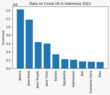
The first chart we will create is a bar chart.
Bar charts use horizontal or vertical bars to show comparisons between categories. The longer a bar, the greater the value it represents. One axis on the chart shows the categories (dimensions) being compared, and the other axis represents discrete values (metrics).
Here we use data on the development of covid-19 in Indonesia by Province.

Results

source https://www.antaranews.com/covid-19
The second diagram that we will create next is a pie chart.
A pie chart is a pie chart that is divided into slices to represent numerical proportions. In a pie chart, the arc length of each slice is proportional to the quantity it represents.
Here's the number of votes each food got when I asked a group of people what their favorite type of food was.

Results

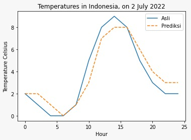
The last chart that I will make next is a Line Graph chart.
A line graph is a type of graph that depicts some data in the form of lines or curves. Line graphs are used to describe a development or change in data over time. A line graph has 2 main axes, the X axis and the Y axis.
The following is the temperature data in Indonesia on July 2, 2022.

Results

Informasi Course Terkait
Kategori: Data Science / Big DataCourse: Data Science