EDA with Heart Disease Dataset
Reggina Kuswandi The

Summary
Exploratory Data Analysis (EDA) is an approach to analyze the data using visual techniques. It is used to discover trends, patterns, or to check assumptions with the help of statistical summary and graphical representations.
Data Visualization is the process of analyzing data in the form of graphs or maps, making it a lot easier to understand the trends or patterns in the data. There are various types of visualizations :
- Univariate analysis: This type of data consists of only one variable. The analysis of univariate data is thus the simplest form of analysis since the information deals with only one quantity that changes. It does not deal with causes or relationships and the main purpose of the analysis is to describe the data and find patterns that exist within it.
- Descriptive statistics, namely describing or summarizing data so as to produce general information without aiming to draw conclusions.Descriptive statistics can display some important information such as the mean, median, mode, standard deviation, variance and concavity. These descriptive statistics can be displayed in various forms such as tables, charts, graphs, etc.
- Multi-Variate analysis: When the data involves three or more variables, it is categorized under multivariate.
Description
About Dataset
Heart disease (heart disease) is a group of diseases related to cardiovascular diseases, manifested by a violation of the normal functioning of the heart. May be caused by damage to the epicardium, pericardium, myocardium, endocardium, valvular apparatus of the heart, heart vessels.
Heart disease can last a long time in a latent form, clinically not manifesting itself. Along with various tumors, these diseases are today the main cause of premature death in developed countries.
The uninterrupted operation of the circulatory system, which consists of the heart as a muscle pump and a network of blood vessels, is a necessary condition for the normal functioning of the body.
According to the National Heart, Lung and Blood Institute in Framingham (USA), the most important factors in the development of cardiovascular disease in humans are obesity, sedentary lifestyle and smoking.
About Project :
In this project I will do an exploratory data analysis using the heart disease dataset in 2020 which I took on the kaggle.com platform. Knowing that EDA is an important process in data analysis because through EDA we can save more time in the data analysis process, can find out data errors such as missing values and duplications, and can understand data visualization through techniques in EDA as I used in this project is using descriptive statistics by displaying visualization data in the form of tables, diagrams, graphs, etc.
Preparation
First, we can search and download unique public datasets that are available on the Kaggle.com platform. You can click on the dataset that I have via this link https://www.kaggle.com/code/georgyzubkov/heart-disease-exploratory-data-analysis/notebook
Second, open Google colaboratory via browser. After that, create a new notebook in the Google colaboratory and rename the notebook.

Third, input and upload the dataset that has been downloaded via kaggle.com.

So, we have saved the dataset and created a notebook file in google colaboratory.
Preprocessing
- Import the required module for preprocessing.

- Load dataset

- Indentify the shape of the dataset and Get the list of columns

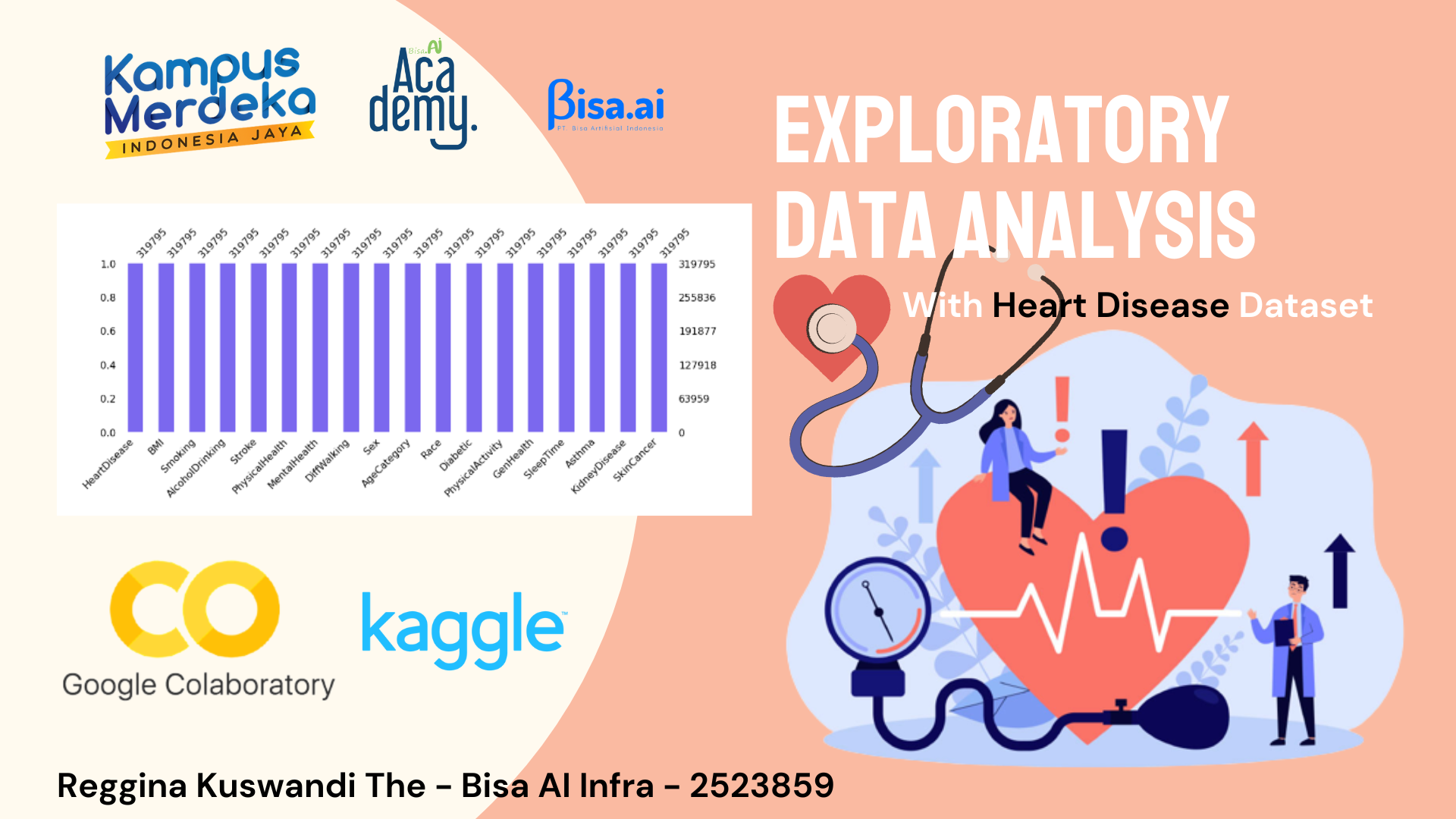
Let see the data sample is very informative and is represented by 319 thousand patients on 18 criteria.
What features characterize our data sample?
- Heart Disease - target trait.
- BMI - a value that allows you to assess the degree of correspondence between a person's mass and his height, and thereby indirectly judge whether the mass is insufficient, normal or excessive. It is important in determining the indications for the need for treatment.
- Smoking is a major risk factor for cardiovascular disease. When smoke from a cigarette is inhaled, the reaction of the cardiovascular system immediately follows: within one minute, the heart rate begins to rise, increasing by 30% within ten minutes of smoking. The bad habit also increases blood pressure, fibrinogen and platelet levels, making blood clots more likely.
- Alcohol Drinking - alcohol causes not only temporary disturbances in the functioning of the heart, but also permanent ones. Heart pain after alcohol is not the only health problem associated with alcohol consumption.
- Stroke - Ischemic stroke occurs 4 times more often than hemorrhagic. One of the leading causes of this suffering is heart disease, which impairs its functioning, as a result of which the blood flow in the arteries is disturbed and the blood supply to the brain is reduced. Another cause of stroke in heart disease is thromboembolism, when clots form in the cavities of the heart (most often with heart failure) - blood clots.
- Physical Health - how many days in a month did you feel poor physical health.
- Mental Health - how many days in a month did you feel poor mental health.
- Diff Walking - difficulty climbing stairs.
- Sex - gender of a person.
- Age Category - age category of the subjects. *Race-obviously:)
- Diabetic - obviously :)
- Physical Activity - adults who reported doing physical activity or exercise during the past 30 days other than their regular job
- Gen Health - well-being.
- Sleep Time - number of hours of sleep.
- Asthma- obviously :)
- Kidney Disease - obviously :)
- Skin Cancer - obviously :)
- Identify data types for each column

- Get bassic dataset information

Check the dataset for gaps in the data

- Identify missing values

There are no missing values!
- Identifiy duplicate entries/rows


In our dataset there are 18078 duplicate data, so we need to drop duplicate data. So, the existing data becomes 301717 from 319776 with 18 columns.
- Describe the dataset

Numeric variables are BMI, Physical Health, Mental Health, Sleep Time. The rest are categorical.
We have the hypothesis : there are outliers in the data for both maximum and minimum values.
- Knowing the correlation matrix

Through the correlation matrix we can find out that every data between BMI, Physical Health, Mental Health, and Sleep Time has a correlation with one another.
Data Visualisation with Descriptive Statistics Techniques
- Import the required module in the description statistics

- Data visualisation with Heatmap

Through the heatmap visualization data we can find out through the colors displayed. The darker the color, the lower the correlation, and the lighter the color, the higher the correlation.
- Data visualisation with Bar Plot

Through the data frame that we have, we will find out how many heart diseases are in our dataset. And we get that as many 27261 have heart disease and 274456 do not.

- Data visualisation with Pie Chart

- Data visualisation with Line Plot


- Data visualisation with Histogram

- Data visualisation with Box Plot


- Data visualisation with Scatter Plot

- Data visualisation with Pair Plot


- Data visualisation with Violin Plot

Informasi Course Terkait
Kategori: Data Science / Big DataCourse: Infrastuktur Kecerdasan Artifisial (SIB AI-INFRA)